




Portrait of Lydia Allet
Lydia Allet · Product Manager & Product Designer

From discovery to revenue

I help decide what is worth building, design it, and stay with the team until it ships. Six years on B2B SaaS and consumer products for Swiss banks, the State of Vaud, TPG, industry, and my own subscription app.

Geneva banks Performance Watcher Omega TPG Canton de Vaud Product DNA
×2+completed online mortgage applications
1.1% → 6.5%paywall conversion on my own app
10 monthsfrom the first discovery interviews to the first signed client
70% → 54%website bounce rate after relaunch
Case Studies

Selected work

Five cases, each told from both sides: the product decisions and the design behind them.

Product DNA · Product Manager & Designer · 2025–now

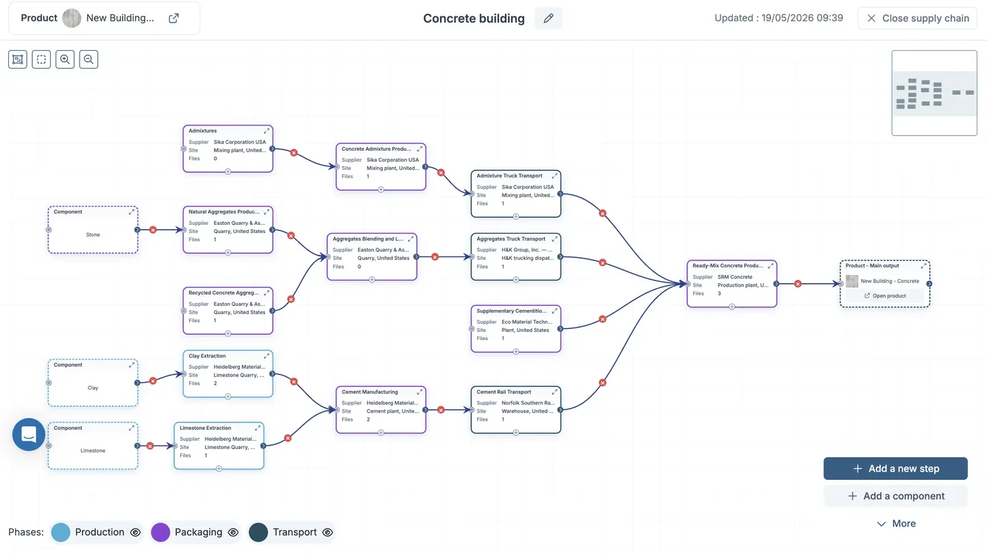
Taking a traceability SaaS into construction

Defining what construction groups would pay for, then building it with 6 developers: orders as the entry point, key materials only, tier-1 suppliers as relays.
10 monthsfrom first discovery interviews to first signed client
5+leads among top French and Swiss construction groups
70→54%bounce rate after the website relaunch
B2B SaaS
Read the full case

Context

Product DNA is a B2B SaaS traceability platform. To enter construction, it needed an offer that traces key materials and their footprint across suppliers. The hard part was the scope: complement the site management tools clients already use, or replace them? Calculate CO2, or sync it from other tools?

Users & my role

Buyers, CSR teams and decision-makers, working from the office. I co-defined the vision and roadmap with the CTO, led discovery and user testing, designed the product end to end, and took 6 developers from user stories to functional QA.

What I found

  • Traceability starts with orders, not with the construction site.
  • Clients trace key materials, not every component of the chain.
  • Tier-1 suppliers reach their own suppliers far more easily than the client can.
  • Site management tools are complex, and clients did not expect traceability from them.

Product decisions

  • Orders as the entry point, where traceability starts.
  • Key materials only, instead of mapping the entire supply chain.
  • Tier-1 suppliers cascade the request: the most data for the least effort.
  • Complement, don't replace existing site management tools.
  • A CO2 calculator: cheap to build, directly useful to CSR teams.

Trade-off

We gave up covering site management and the full supply chain, and accepted depending on clients' existing tools and tier-1 suppliers' cooperation. In exchange, a small team shipped a focused product and signed its first client 10 months after discovery began.

UX decisions

  • Desktop-first, built for analysis: compare the footprint of each product, material and supplier.
  • Supplier follow-up made visible: every request and response in one place.
  • Compliance, due diligence and reporting come straight out of the collected data.
  • Prototypes in days with Claude and Claude Design, tested with clients before development.
  • An AI-friendly PrimeNG design system that cut design-to-dev friction.

Also delivered: the website relaunch

The old site had an unclear message and an old-fashioned design. I rebuilt it with marketing and sales for executives and buyers, set up Mixpanel before launch, and mentored the intern who developed it. Bounce rate fell from 70% to 54% and p75 session duration doubled.
Swiss bank · Product Designer via CBTW

Doubling online mortgage applications

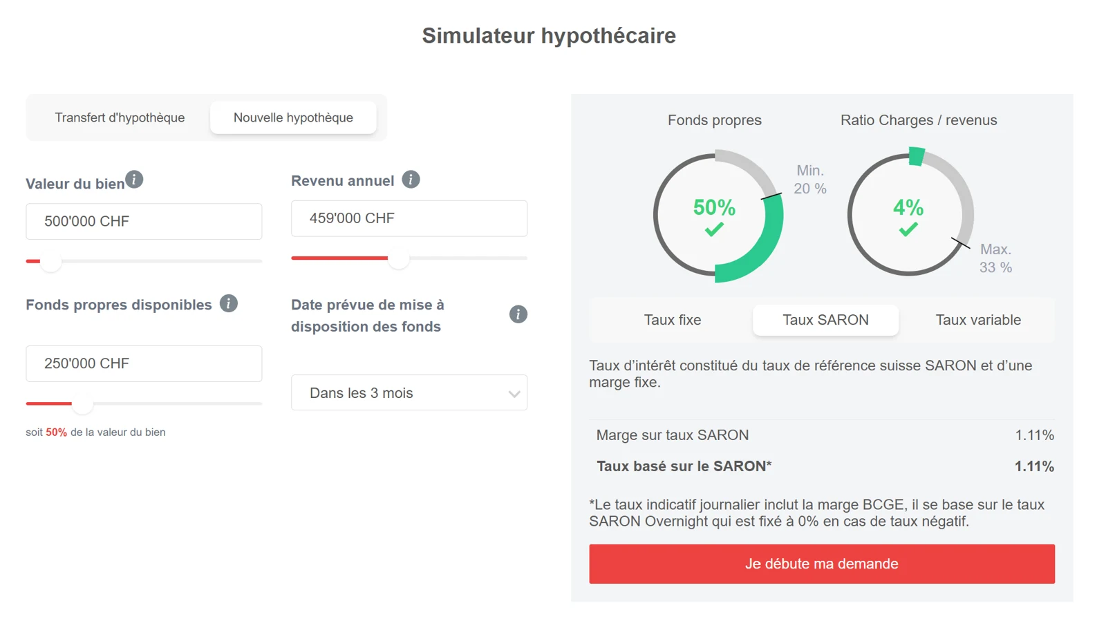
A simpler website, a simulator, and an advisor tool redesigned as one journey, so every application started online gets followed through.

×2+completed online applications
80%of cases covered by one advisor workflow
1tool for documents, valuations and decisions
Banking
Read the full case

Context

Prospects struggled with a complex website, and few completed an online application. Behind it, advisors juggled several separate processes: documents scattered across tools, valuations from different external services, complex cases hard to track.

Users & my role

Prospective borrowers and mortgage advisors. As Product Designer at CBTW, I ran needs definition with business, IT and advisors, then designed the client journey and the advisor tool with the bank's internal experts and the CBTW product team.

What I found

  • About 80% of applications follow the same steps; a minority need special handling.
  • Documents and valuations sat in different places, which slowed follow-up.
  • Few prospects completed an application on the old website.

Product decisions

  • One product, two sides: otherwise the redesign only moves the bottleneck.
  • 80%, not 100%: one standard workflow, exceptions handled separately.
  • A simulator before the form, turning visitors into qualified applicants.

Trade-off

Edge cases stay outside the standard workflow and are handled separately. In exchange, the bank got a tool faster to deliver, easier to learn, and better at following up most clients.

UX decisions

  • A simpler client website, so prospects understand the offer and start without friction.
  • Centralized documents and clear decision points at every checkpoint for advisors.
  • Valuations synced automatically from the external services.
  • Tested with advisors; the client journey followed through website metrics.

Swiss financial software · Product Designer via CBTW

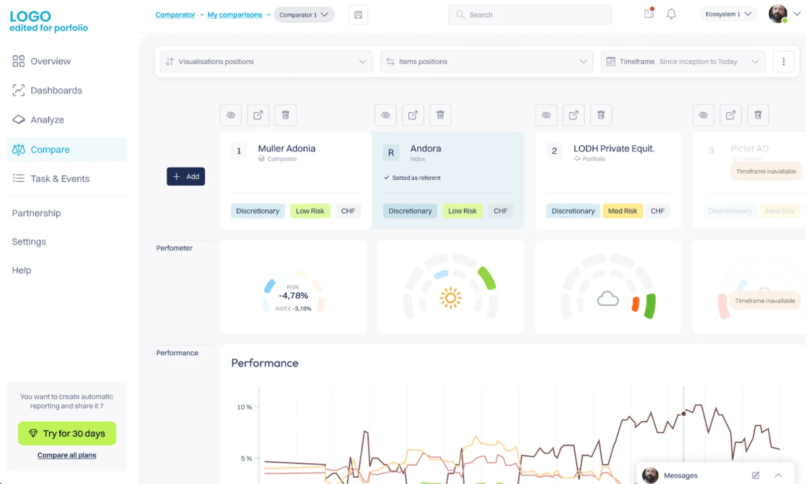
A portfolio tool for 10+ Swiss private banks

Rebuilding a daily tool for wealth managers from their needs, not from its legacy screens, with C-levels and experts with 20+ years of experience.

10+private banks using the tool
3partner banks in user tests
20+ yrsexperience of the experts co-designing
Wealth
Read the full case

Context

The tool lets wealth managers track client portfolio performance and compare investment strategies. After years of features added on request, it suffered from overload and heavy UX debt.

What I found

  • Features added over the years had overloaded the interface.
  • Users needed clarity, efficiency and performance.
  • Comparing portfolios was central to their daily work.
  • Tests in 3 banks revealed friction that never came up in workshops.

Product decisions

  • Start from needs, not from the old screens, to avoid copying their debt.
  • Prioritize with the people who use it, in workshops with senior stakeholders.
  • Desktop first, mobile later.

UX decisions

  • A clear hierarchy for dense financial data.
  • Comparison of portfolios and strategies as a core flow.
  • Hi-fi prototypes tested in 3 partner banks; development followed through integration.

Trade-off

Ignoring the old interface freed the design but risked missing needs it served implicitly. User tests in 3 banks were the safety net. After rollout, users described the new interface as much easier and more intuitive.

TPG · Product Designer via CBTW

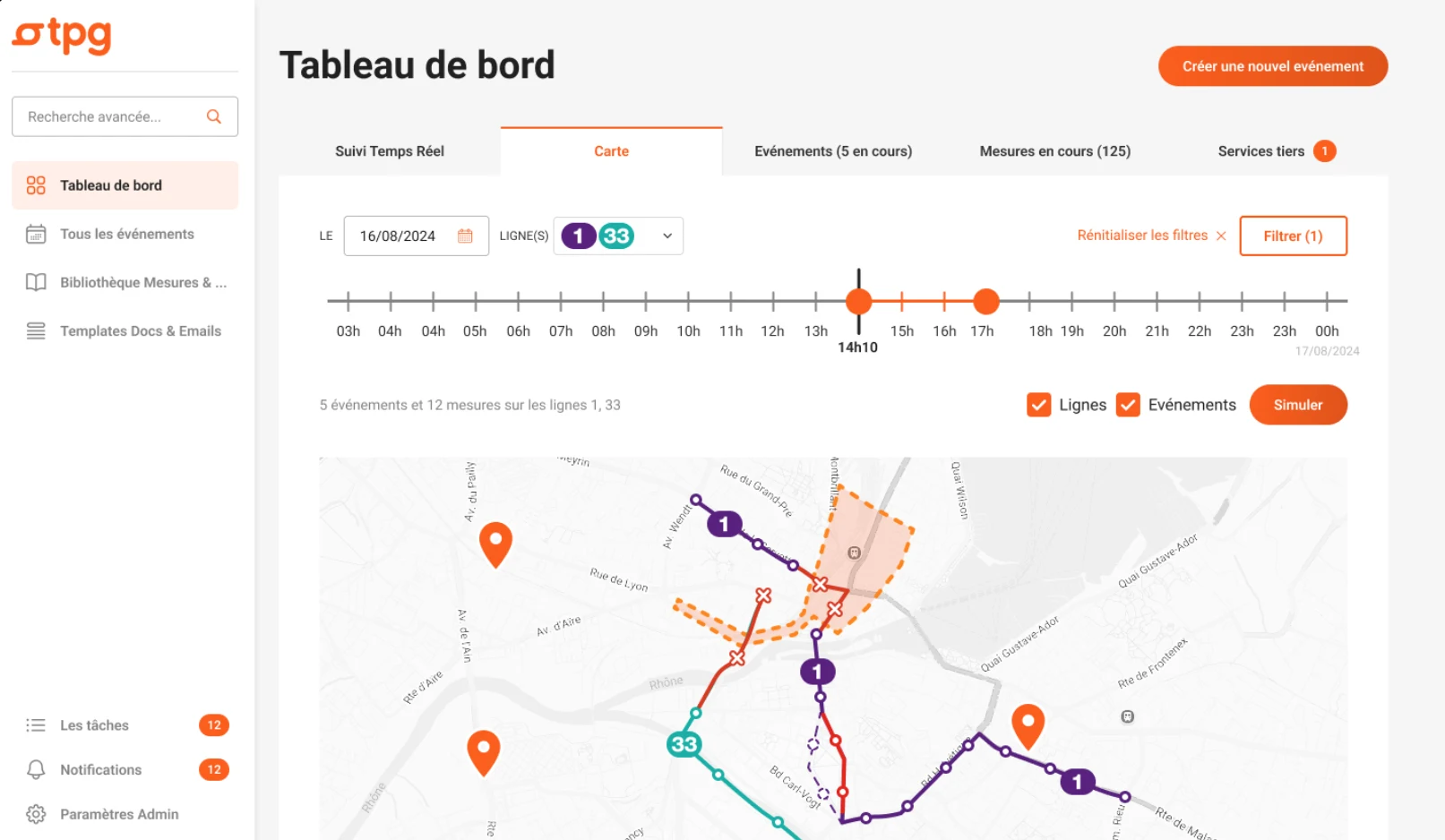
Rebuilding a 9-year-old event management tool

One collaborative platform for the departments that coordinate every event on the Geneva transport network, built from an audit, workshops and service blueprints.

20+users across 6+ departments
~10workshops, from operations to legal
3service blueprints driving priorities
Public transport
Read the full case

Context

TPG coordinates every event affecting the Geneva network through one internal tool: planning, coordination, real-time monitoring, legal and logistics. Built over 9 years without a product approach, it had a long onboarding, a fragmented experience, unused features and dependencies on systems such as SAP.

What I found

  • The tool was full of friction and duplicated features nobody used.
  • Departments shared needs, scattered across separate tools.
  • Information was siloed, which made coordination slow.

Product decisions

  • Audit before redesigning, for an objective basis.
  • Map the whole system with three service blueprints.
  • Cut, then unify: unused features dropped, shared needs merged.

UX decisions

  • One platform adapted to each department's rhythm, unified in language and navigation.
  • Clear roles for each department in every event.
  • Current and upcoming events at a glance, with a fast path for emergencies.

Trade-off

One shared platform instead of tools tailored to each department. Each team gives up some specific features, but everyone sees the same event, in the same place, at the same time.

Tarotale · Founder, PM & Designer · 2024–now

6× paywall conversion on an AI app I built solo

A subscription app taken from idea to the App Store and Google Play: discovery, monetization, UX/UI, FlutterFlow build, LLM quality and launch.

1.1→6.5%paywall conversion (mobile avg ~3–4%)
−50%daily churn, 1.6% → 0.8%
~600monthly active users, profitable since launch
Consumer · AI
Read the full case

Context

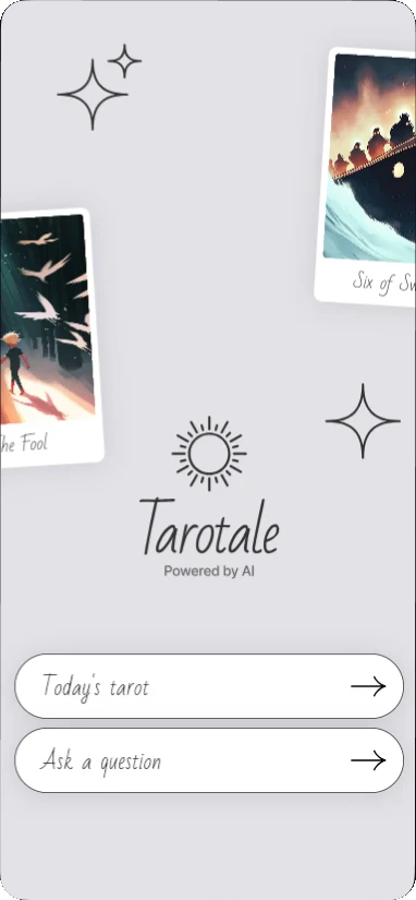
Tarotale is an AI-powered tarot app, live since February 2025. I built it alone, as a real business: a subscription product people pay for and keep using, in a crowded category.

What I found

  • The paywall was converting poorly, at 1.1%.
  • Users had no reason to come back between readings, which drove daily churn.
  • Users questioned the readings' credibility, a risk for subscriptions.

Product decisions

  • Monetization by experiment: offer, framing, price and timing tested in RevenueCat.
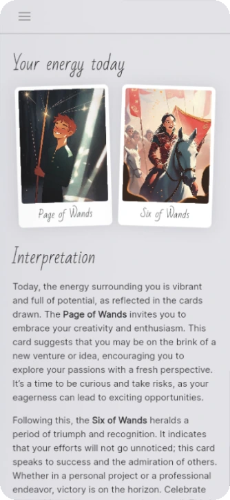
  • Retention through habit: a free daily feature halved daily churn.
  • AI quality as a product problem: LLM output and presentation iterated until trust complaints stopped.
  • Getting to market: an App Store rejection appealed and approved; Android tester phase; Google, Meta and Apple Search Ads, ASO and UGC.

UX decisions

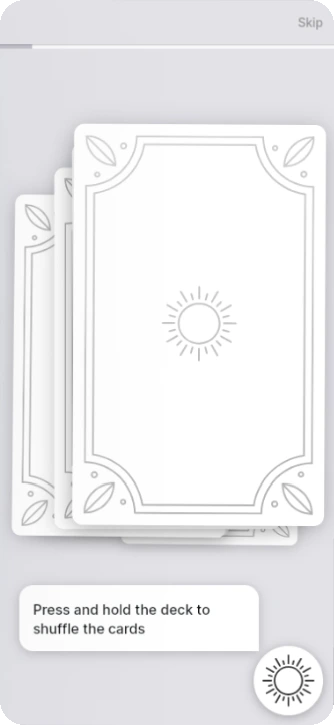
  • Emotional onboarding: card animations, video and sound in the first minutes.
  • A modern take on a traditional genre, respectful of its symbolism.
  • One visual universe, generated with Midjourney and reworked by hand.

What I learned

Owning every metric changed how I design: every screen is a hypothesis about conversion or retention, and RevenueCat tells you within days if you were right.

Approach

How I work

An engineer's rigor, a designer's eye, and a product person's question: will anyone pay for this?

1
Before building

Discovery & strategy

Interviews, competitor analysis, workshops with business, IT and users. I define the scope and what to leave out.

2
While building

Design & delivery

Prototypes tested with real users, design systems, specs and acceptance criteria developers can build from.

3
After launch

Measure & iterate

Mixpanel, RevenueCat, functional QA. Every release is judged on behavior, not opinions.

Break time

Ship the MVP

Catch the real insights, dodge the scope creep. 30 seconds: shorter than a sprint review.

Score030sBest0

Ship the MVP

Move with your mouse, your finger or the arrow keys.

User insight +1Scope creep −2
Lydia Allet Hi, I'm Lydia
About

An engineer who designs products people pay for

I trained as an engineer in ergonomics, design and mechanical engineering at UTBM, then spent six years designing digital products, four of them in Geneva and Vaud.

Today I work AI-native: Claude and Claude Design from ideation and prototyping to spec-driven development. I also build with FlutterFlow and Mendix, and run a profitable app of my own.

CertifiedPSPO I & IIScrum.org
LanguagesFR · RU · ENNative French and Russian, fluent English
Based inMies, VaudPermit B
SpeakerSwiss IT Forum 2024Environmental impact of digital projects
Contact

Building a product? Let's talk.

Open to Product Manager, Product Owner and Lead Product Designer roles in Geneva and Vaud. I answer in French, English and Russian.

alletlydia@gmail.com
+41 76 610 20 85